
BloodFlow – Smart Blood Donation Tracker
Blood Donation App
How can we encourage the younger generation to donate blood regularly?
BloodFlow is an innovative mobile application designed to simplify blood donation tracking and increase user engagement. The project combines intuitive UX, modern design, and elements of gamification—without competition. By leveraging a clear UI and minimalist experience, the app enables users to track their donations, receive reminders for the next eligible donation date, and make a real impact on people’s lives.
📌 Project Type: UX/UI Design, Prototype
📌 Role: UX Designer, UI Designer
Project Context and Challenges
Who is the Target User?
The target audience consists of young individuals actively engaged in blood donation. These users value convenient and modern solutions while wanting full control over their donation history. Their key needs include ease of use, clear data visualization, and subtle motivational elements that encourage regular blood donations
Project Goal
The goal of this project is to create an intuitive and engaging solution that simplifies blood donation tracking and encourages users to donate regularly. The design must balance functionality with a modern, visually appealing interface while adhering to native iOS guidelines.
Key Challenges
- Simplicity & Intuitiveness – Designing a single-screen experience with interactive popups for smooth navigation.
- WOW Effect & Unique UI – Creating a visually distinctive and aesthetically appealing interface that stands out from existing blood donation apps.
- Motivational Elements Without Competition – Encouraging users to donate regularly through engagement mechanics without fostering unhealthy competition.
- iOS GUI Consistency – Ensuring a seamless, native user experience aligned with Apple’s interaction and accessibility guidelines.
Creative Process
UX Research, Competitive Analysis, Testing & Hi-fidelity UI Design
Research & Analysis
Examining iOS patterns and competitor apps to identify best UX practices and unique solutions.
Paper Prototyping
Creating quick interface sketches to test layout and navigation before digital design.
Guerrilla Testing
Conducting simple usability tests with a small user group to assess interface intuitiveness.
Hi-fidelity UI Design
Designing the final interface with refined colors, typography, and animations aligned with iOS guidelines.
Research & Analysis – iOS GUI
How did I ensure iOS consistency?
I designed the app based on Apple’s official guidelines to provide users with an intuitive and seamless experience within the iOS ecosystem. By analyzing best practices from Apple applications, I optimized the interface using native system components.
- Navigation → Implemented a bottom tab bar for quick access to key features and a simplified navigation flow.
- UI Components → Used system buttons, text fields, and popups to enhance consistency and usability.
- Typography & Colors → Applied the SF Pro font and system color palette to ensure readability and accessibility.
This approach makes the interface both visually appealing and fully aligned with iOS standards, ensuring a smooth user experience and easier implementation in a native app.


Competitive Analysis – App Features
What features do competing apps offer?
I conducted an analysis of blood donation apps from different countries to identify their key features and potential gaps that we can leverage to improve our product.
Key Findings:
- Most apps offer basic features such as appointment booking, donation history, and notifications.
- Not all apps provide information on low blood supply types, which could raise awareness and encourage donations.
- Tracking who received your blood donation is a rarely available feature, present in only one of the analyzed apps.
- A rewards system is present in most apps, but gamification (badges, levels) is far less common.
- Personalized user recommendations are not available in any of the analyzed apps – our app is the first to introduce this feature.
- None of the competing apps integrate AI – no app currently offers an AI Assistant for personalized user experience.
Based on this analysis, I designed an app that fills market gaps and introduces unique features to enhance user motivation and experience.
Paper prototyping
Early Concept Testing & Iteration
Paper prototypes allowed me to quickly validate the screen layout, interactions, and information hierarchy before moving to digital design. This step ensured that users could easily access key features and navigate intuitively.
- Main Screen → Displays user details, donation progress, and quick actions.
- Donation Details Popup → Shows donation date, type, blood volume, and recipient status.
- Prototyping Goal → UI preparation, enhancing readability, and validating interactions.
This process helped me iterate quickly and optimize the interface, ensuring a better user experience in the next design phases.

Guerrilla Testing – Quick Usability Insights
To quickly validate the usability of the app, I conducted guerrilla testing with 3–5 users. The goal was to assess the intuitiveness of the navigation, identify pain points, and ensure a smooth user experience. Based on user feedback, I introduced key improvements to enhance usability and accessibility.
Key Findings & Improvements
Clearer Donation Tracking
Some users were unsure how to interpret the donation progress bar. I refined its visual representation to improve clarity.
More Emphasis on Blood Type Information
Participants suggested that their blood type and donation history should be more prominent on the dashboard. I adjusted the layout to increase visibility.
Improved Notification System
Users wanted clearer alerts about donation eligibility and blood demand. I refined the notification hierarchy for better engagement.
UI Design
A modern and cohesive interface designed for intuitive navigation and readability.
Key Design Insights
Color Palette Optimization
The colors were carefully selected and tested to enhance usability and accessibility:
- Red (#FF5247, #D3180C) – The primary accent color, symbolizing blood, energy, and commitment to helping others.
- White – A neutral background ensuring clarity and readability.
- Blue (#0A94FF) – Used for buttons and CTAs, associated with medicine, trust, and safety.
Typography Refinement
The app uses SF Pro, Apple’s native font, ensuring excellent readability, a modern look, and seamless integration with the iOS system.


Final Refinements
Through iterative design and usability testing, I ensured that the app provides an intuitive, engaging, and accessible experience, making blood donation tracking easier and more efficient..
Key Findings & Improvements
Improved Blood Donation Tracking
Some users were unsure how to track their donation history. To address this, I refined the progress bar and donation logs, making them more visually clear and informative.
Enhanced AI Assistant Usability
During testing, users were uncertain what kind of questions they could ask the AI Assistant. To improve usability, I introduced a chat interface with suggested prompts, making interactions more intuitive and helpful.
Streamlined Notifications & Blood Alerts Confirmation
Users requested clearer donation reminders and a way to confirm urgent blood requests. I redesigned the notification system and added confirmation prompts, improving clarity and engagement.
Launch Screen
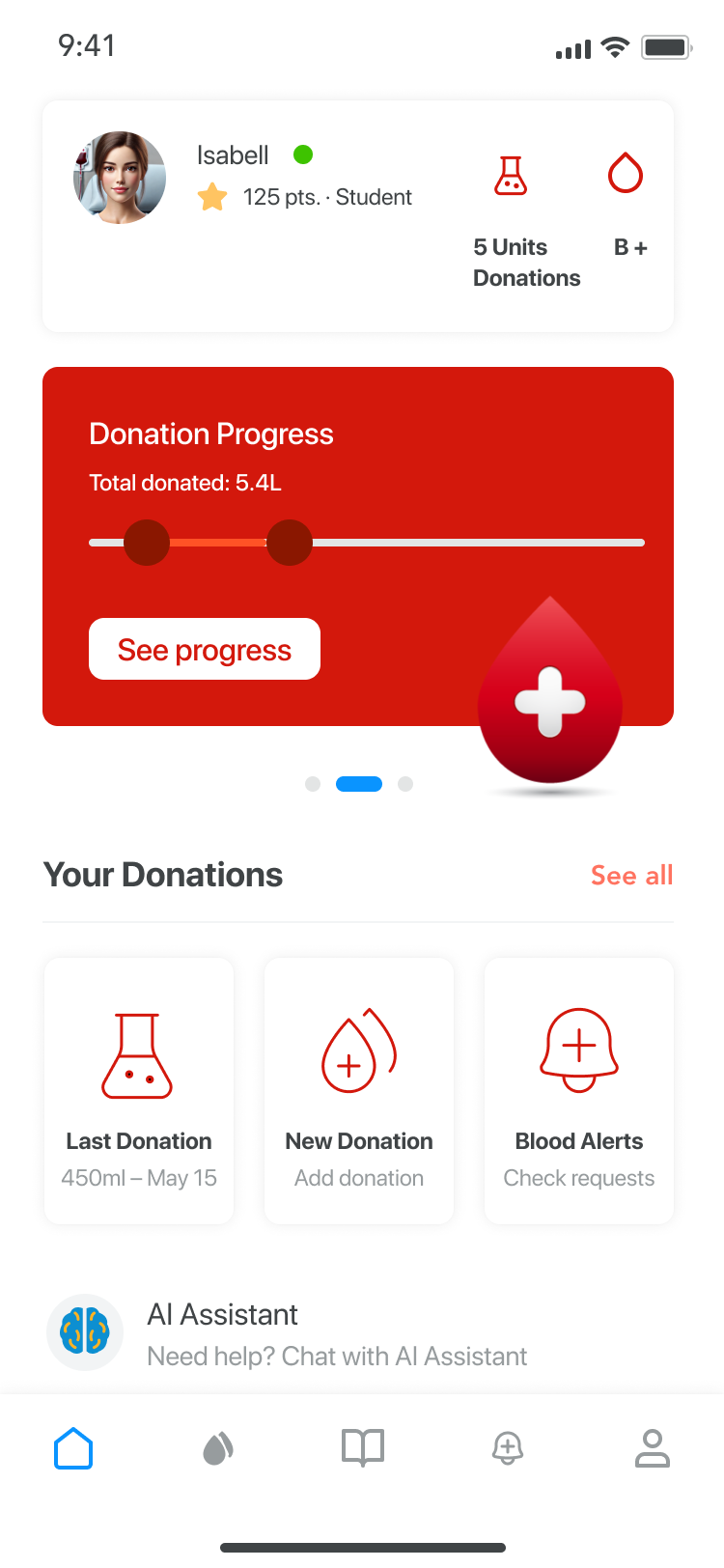
Home
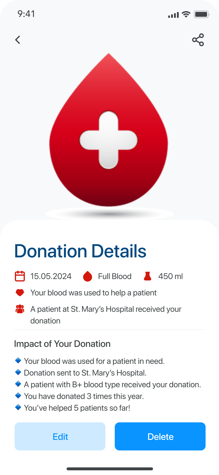
Donation Details
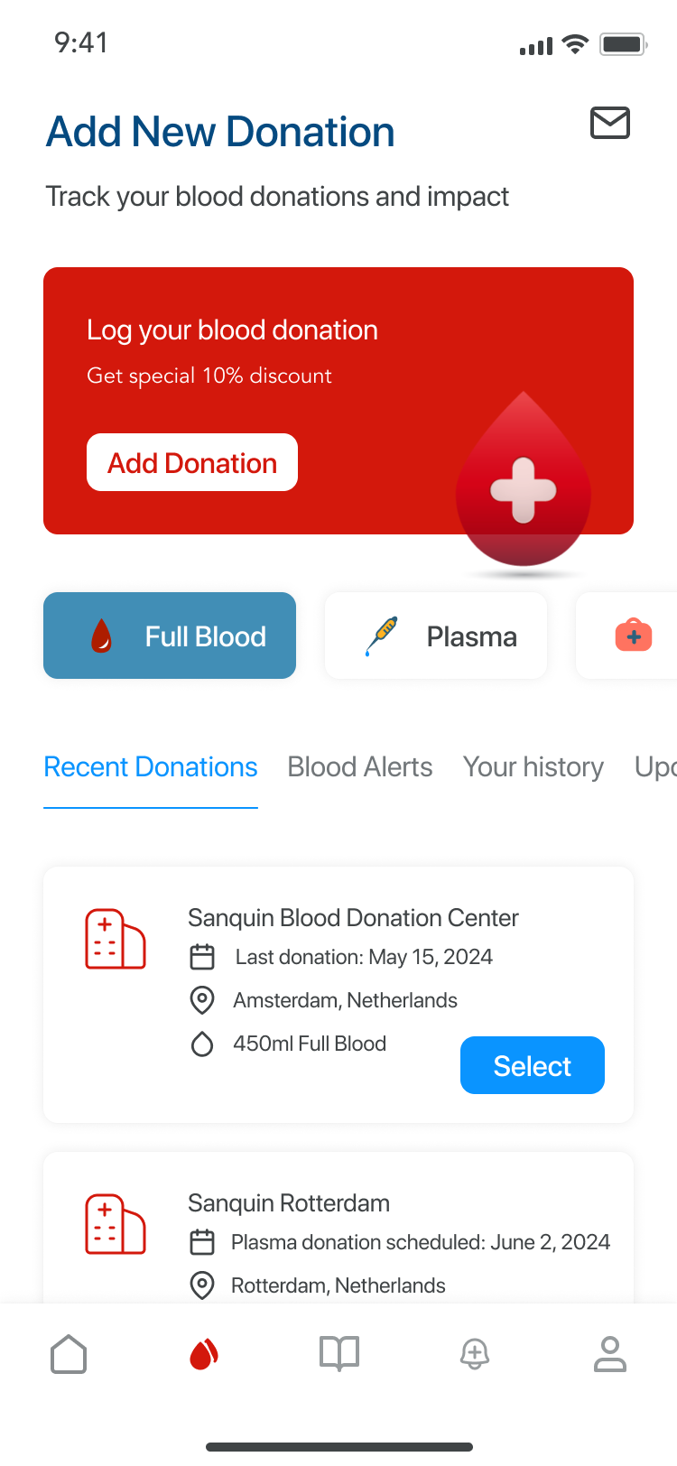
Add New Donation
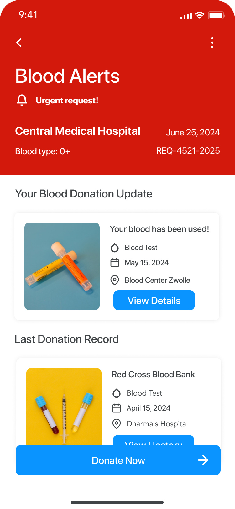
Blood Alerts
A modern blood donation app – smart features, AI Assistant, and an intuitive interface
Project Summary
The blood donation app is designed to simplify donation tracking, enhance user engagement, and improve accessibility. With an AI Assistant, clear progress visualization, and smart notifications, users can easily manage their donations and stay informed.
Product
- Advanced donation tracking – Users can monitor donation history, upcoming eligibility, and total contributions.
- Clear and structured interface – A user-friendly layout ensures effortless navigation and quick access to key features.
AI Integration
- AI Assistant for user support – Provides personalized reminders, answers common questions, and suggests optimal donation times.
- Smart recommendations – The system learns user preferences and offers tailored donation insights.
Communication
- Transparent notifications and alerts – Users receive clear updates on blood demand, donation eligibility, and health tips.
- Optimized engagement – A balance between usability and motivation ensures a smooth, rewarding experience.